
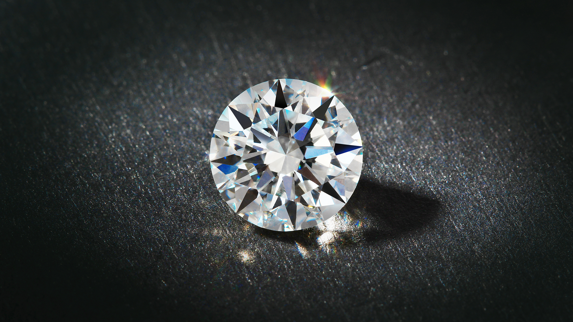
Why Moissanite Jewelry Looks Different in Every Setting
Two pieces can use stones of the same shape and millimeter size yet look surprisingly different on the hand, ear or neckline. The reason is simple: a finished piece is more than a gemstone. Its height, metal color, stone spacing, under-gallery and proportions form a visual system. Understanding that system helps shoppers compare Moissanite Jewelry without reducing quality to a single grade or carat-equivalent number.
This guide explains how the structure around a stone changes its apparent scale, contrast, movement and comfort. It does not replace a cut-quality review; instead, it shows why the same well-cut stone can read as delicate, bold, bright, warm, modern or vintage after it is set.
Start with the viewing angle, not the product thumbnail
A front-facing image mainly shows outline and sparkle. It rarely reveals how far the piece projects, whether the basket sits close to the body, or how much metal surrounds the stone. Those side and underside views often explain the difference between a setting that feels airy and one that feels substantial.
Compare at least three angles: straight on, profile and underside. For rings, add a hand view. For pendants and earrings, look for an image that shows how the piece hangs. A design that photographs large from the front may have a very light gallery, while a smaller-looking design may use a heavier frame and feel more grounded in person.
Setting height changes silhouette and daily wear
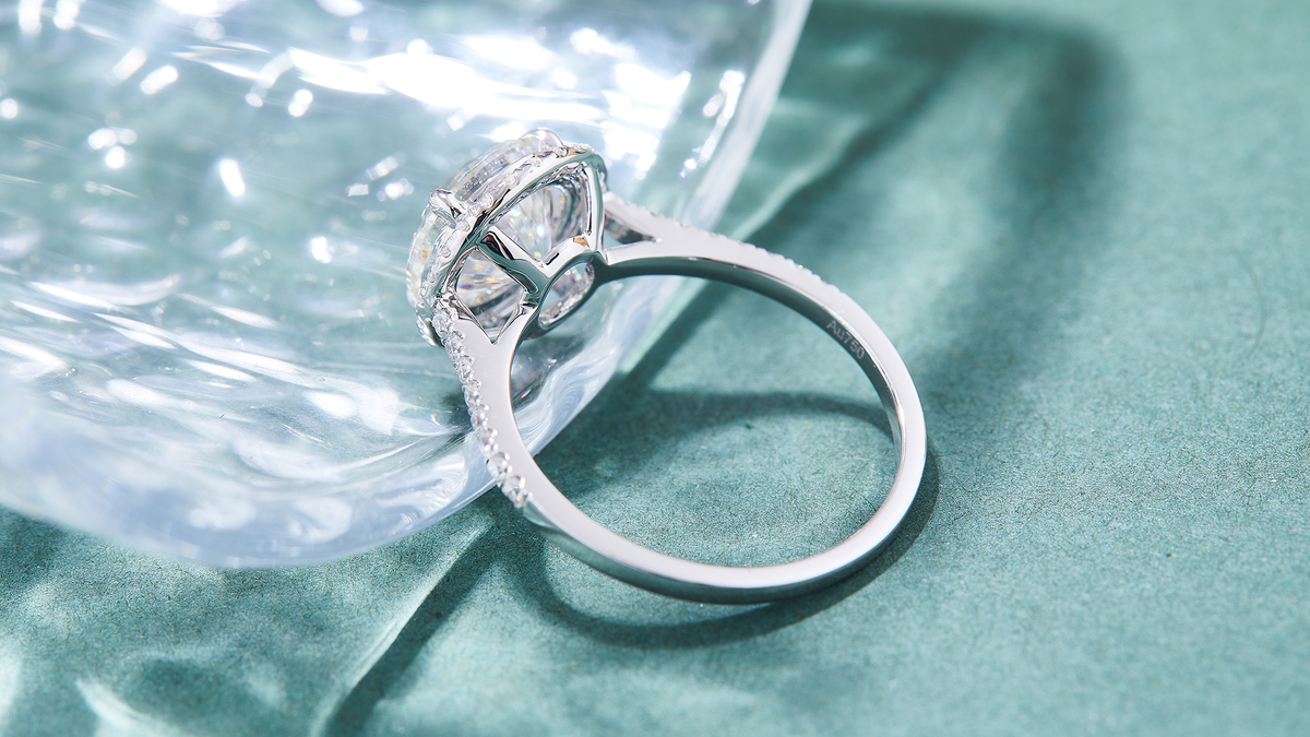
A higher setting can create a more prominent outline and leave room for a straight band to sit beside a ring. It may also catch more easily on knitwear, gloves or hair. A lower setting keeps the center closer to the finger or ear, which can feel practical, but it may limit how another piece fits beside it.
Height alone is not a quality score. The useful question is whether the height suits the purpose. An occasional statement ring can tolerate more projection than a ring worn through typing, travel and household tasks. Stud earrings benefit from a basket that balances the stone without tipping forward. Pendants need a center of gravity that lets the face settle outward rather than flip.
Metal color creates a frame and changes contrast
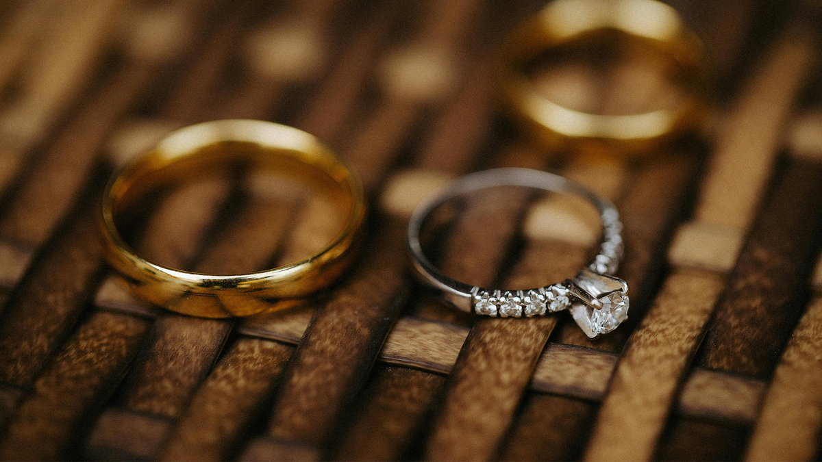
White metal gives a cool, continuous border around a colorless stone. Yellow or rose tones create visible contrast, especially at the prongs, bezel edge and gallery. Neither option is automatically brighter. The effect depends on how much metal is visible and where reflections enter the stone.
Look closely at mixed-color designs. White prongs with a warm shank can keep the immediate frame cool while preserving a yellow- or rose-toned band. A full bezel shows more metal than fine prongs, so its color becomes a stronger part of the design. Product copy should describe the base metal and any surface finish clearly instead of relying on color names alone.
Stone spacing controls rhythm, coverage and perceived size
A solitaire isolates one center and makes negative space part of the look. A halo reduces that negative space and creates a wider visual footprint. Closely matched stones in a line create continuous brightness, while slightly wider spacing produces a lighter, more articulated pattern.
For multi-stone pieces, consistency matters as much as individual sparkle. Compare alignment, gaps, table orientation and the way the row curves. Uneven spacing is especially visible in hoops, tennis styles and bands because the eye reads the stones as a sequence. A balanced sequence can make modest stones look intentional; an irregular sequence can make a larger total weight look less refined.
The under-gallery affects access, structure and appearance
An open underside may make cleaning easier because a soft brush and rinse can reach the back of the stone. A more enclosed structure may protect particular edges or support the design. The right choice depends on the gemstone, setting method, amount of metal and intended wear; an open back is not automatically superior.
Inspect how the gallery connects to the shank, post, bail or link. Connections should look deliberate and symmetrical, with no sharp interior edges where the piece touches skin or fabric. For a deeper explanation of open and closed backs, link readers to MOSUP's existing setting guide rather than duplicating it here.
Comfort is part of what the eye reads as quality
A piece that sits level and moves predictably tends to look more polished in use. Rings should not have rough gallery edges against neighboring fingers. Earring posts should align with the center of balance. Pendant bails should allow the face to settle without forcing the chain into a sharp angle.
This is where Moissanite Jewelry becomes a wear experience rather than a product image. A beautiful front view cannot compensate for a top-heavy stud, a ring that rotates constantly, or a pendant that flips. Product pages are stronger when they include dimensions, profile views and closure details that help buyers anticipate these behaviors.
A five-minute setting comparison
Use the same sequence whenever you compare two designs. It keeps attention on relevant differences and prevents one dramatic photograph from deciding the purchase.
1. Confirm the stone's millimeter dimensions and the full piece dimensions.
2. Compare front, profile and underside views at similar scale.
3. Note setting height, visible metal, spacing and symmetry.
4. Check where the piece touches skin, hair, clothing or another ring.
5. Match the design to the buyer's real routine, not only the occasion.
Use the collection page for style discovery
After readers understand the setting variables, guide them to the MOSUP moissanite collection to compare actual rings, earrings, necklaces and bracelets. The collection should own broad shopping intent, while this article answers the narrower question of why finished designs look different.
That separation protects the commercial page: the blog targets an educational problem, links forward with a descriptive anchor, and avoids presenting itself as the main catalog. It also gives product editors a checklist for adding the views and measurements that make comparison easier.
Frequently Asked Questions
Does a higher setting make a moissanite look larger?
It can make the center look more prominent from the side, but face-up size is driven mainly by the stone's millimeter dimensions, outline and surrounding design. Height should be chosen for fit and lifestyle as well as appearance.
Do yellow-gold prongs make a colorless stone look yellow?
Warm metal can reflect near the stone and create contrast, but the visible result varies with prong size, bezel coverage, lighting and the stone. Review real images in more than one lighting condition.
Is an open-back setting always brighter?
No. Cut quality and cleanliness have a major effect on light performance. An open back can improve cleaning access, while structural needs may justify a more enclosed design.
What information should a useful product page show?
Look for millimeter dimensions, setting height, base metal, surface finish, closure type and clear front, side and underside images. Those details make a setting easier to evaluate before purchase.